Typefaces built from math, art, and sweat.
Our letterform runs through a purpose-built parametric design language, shaped by artistic judgment — engineering and manual artistry in a beautiful duet.
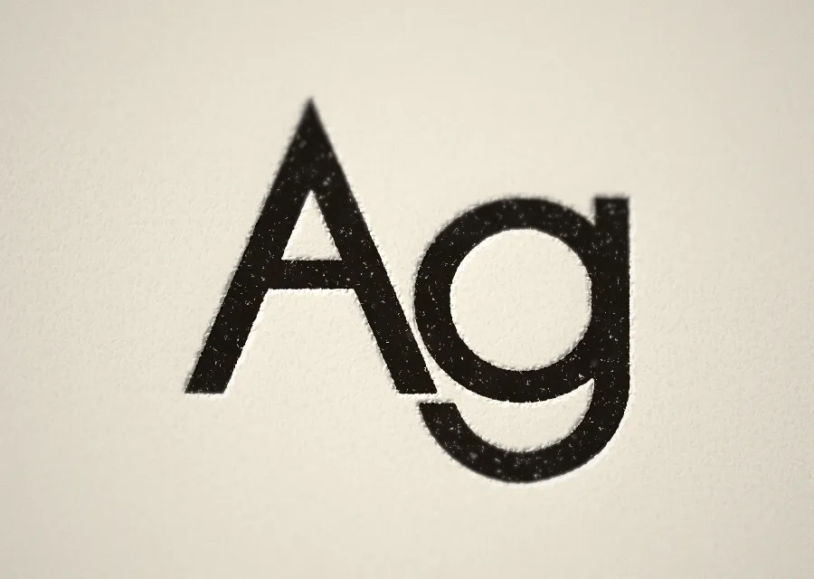
A geometric sans in dialogue with Futura and the Bauhaus's geometric modernism, built from parametric first principles. Full Latin-1, Latin-1 Supplement, and most of Latin Extended-B, with Cyrillic, Armenian, and Greek in beta. Specialty punctuation included: interrobang, asterism, percontation point.
Polybenetron
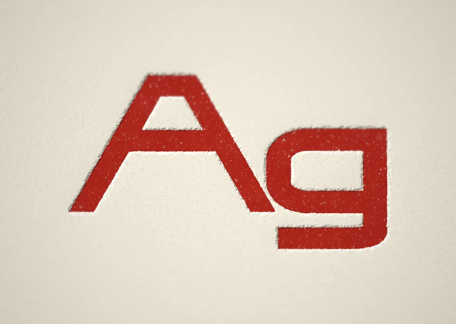
A squared geometric sans in three widths, Narrow, Normal and Extended, each in four weights, with a variable font covering every step between. Basic Latin and Latin-1 Supplement, enough for 188 Latin-script languages.
RETROCHUNKI
A sixteen-segment display face with a slant axis and an unlit layer.
ANOKATH
A fourteen-segment display face after the Burroughs B-7971 neon tube.
Wobblesam
A felt-marker alphabet in which most of the letters look back at you.
The method
A micro foundry with macro ideas.
Cast Iron Type is David Berube's foundry. Letterforms are specified in a purpose-built parametric language, then finished by hand. The catalog stays small on purpose: a family ships when the construction, the axes, and the scripts are ready to test.
Read the full method →No. 06 · On the stone
More from the foundry
More typefaces are in development. Each one gets its own release when it's finished — not before.